Implementing tables and charts
In this tutorial, we will create the interface and logic of a simple application, focusing on data visualization. The project development will cover the following topics:
-
The creation of "Forms", "Fields", and "Relationships" for structuring the database.
-
The construction of "REST Web Services" to provide data and dynamically display information in tables and charts in the application, using the libraries React ChartJS 2 and the dependency Chart.js, in addition to the table component of Ant Design.
The entire visual structure of the project will be developed using HTML, JavaScript, and React.js.
It is recommended that you have basic knowledge of:
- JavaScript
- React.js
- HTML
💡 If you have any questions about these steps, please consult:
- Interface Guide: Forms
- Interface Guide: Fields
- Interface Guide: Relationships between forms
- Interface Guide: REST Web Services
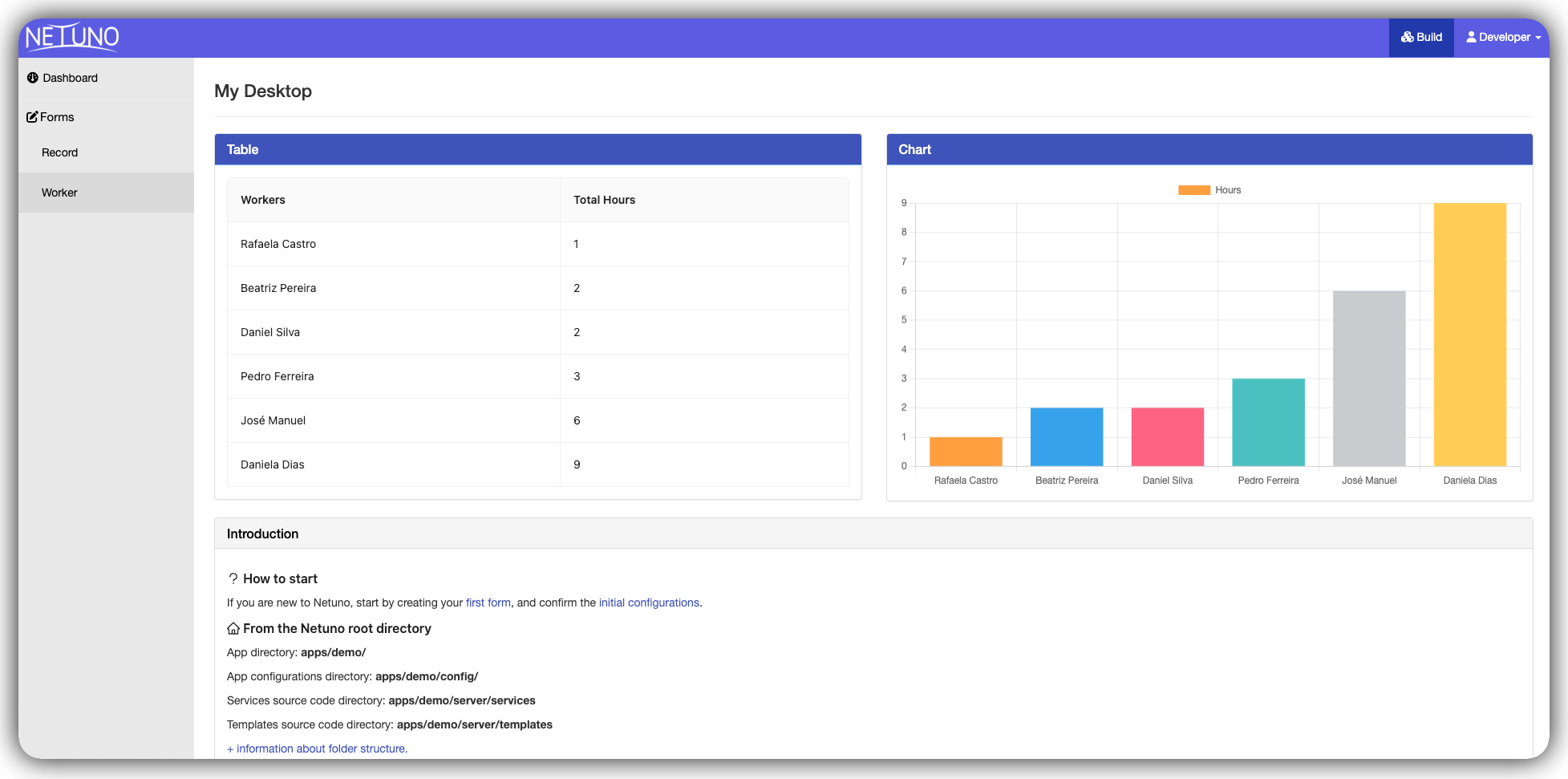
Final Product
By following all the steps in this tutorial, you will build a functional dashboard in the Netuno workspace, containing:
- A data table listing worker records and total hours.
- A dynamic and colorful bar chart visually displaying this same data.
Solution Architecture
Before writing any code, it's important to understand how the pieces fit together. The solution is divided into 4 layers that communicate from top to bottom:
DashboardContainer         (retrieves data from the server)
       │
       ▼
DataVisualization          (organizes the layout into two columns)
       │
  ┌────┴────┐
  ▼         ▼
TableList  ChartBar        (renders the received data)
The advantage of this architecture is that each component has a single responsibility.
Step 1: Data Structure
The first step is to create the forms, configure the relationship between them, and populate them with data to generate the table and chart later on.
This is the diagram with the architecture of the forms and the fields that you should replicate in your Netuno environment:
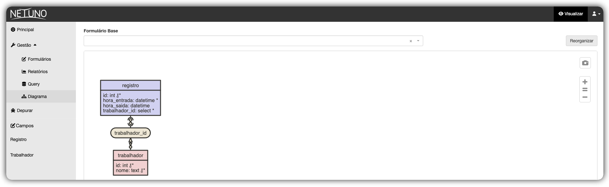
Important: Although the
idfield appears in the diagram, it is not necessary to create it manually. Netuno generates this identifier automatically right after the table is created.
Dashboard Template
To display the table and chart, we will need a location in your application's interface. Netuno already provides a base template for the main dashboard.
Open your code editor and find the file:
/apps/myapp/server/templates/dashboard.html
(Remember to replace myapp with the actual name of your application folder).
You will notice the following line of HTML code:
<div id="app-dashboard"></div>
Step 2: Data Service
Now that we have the database ready and the HTML prepared, we need to create the "messenger" (a REST Web Service). It will be responsible for accessing the database, calculating the total hours of each worker, and delivering this information ready for the table and graph.
Creating the service file
Services in Netuno are stored in the server/services/ folder. Navigate to your project directory and create the file trabalhadores.js:
/apps/minhaapp/server/services/trabalhadores.js
The DashboardContainer detects the dashboard language and calls /services/trabalhadores when the dashboard is in Portuguese, or /services/workers when it is in English. Each language has its own service file.
Writing the code
This code performs three main actions using Netuno's native resources (_db, _val, and _out):
-
Query _db.query: Searches only for active workers in the database and calculates the sum of hours worked by each one.
-
Processing _val.list and _val.map: Organizes the result into a clean list with structured objects.
-
Response _out.json: Sends the data in JSON format so that the interface (React) can read it.
Open the file workers.js and paste the code below:
// 1. Query, _db.query() executes the SQL and returns the list of records found.

const dbRecords = _db.query(`
    SELECT DISTINCT
        worker.name, SUM(DATEDIFF(HOUR, record."start", record."end")) AS total
    FROM worker INNER JOIN record
        ON worker.id = record.worker_id
    WHERE worker.active = true AND record.active = true
    GROUP BY worker.name
    ORDER BY total ASC
`);
// 2. Data Processing, _val.list() creates an empty list to store the processed data.
const list = _val.list();
// Iterates through each row returned by the database
for (const dbRecord of dbRecords) {
    list.add(
        // _val.map() creates an object with the fields that React will consume
        _val.map()
            .set("name", dbRecord.getString("name")) // name → field "name"
            .set("total", dbRecord.getInt("total")) // total hours → field "total"
    );
}
// 3. Response
// Sends the final list in JSON format to the React interface.
_out.json(list);
-
Pay attention to field names: The fields defined here as "name" and "total" are exactly the same as those that the React components will retrieve in the next steps (dataIndex: 'name' and dataIndex: 'total'). They need to be identical.
-
About the active = true filter: The database has an active column in the worker and record tables. By filtering only active records, we ensure that archived or deactivated data does not appear in the table and graph.
## Step 3: Frontend Environment (React)
Now that the backend (database and services) is ready, let's prepare the visual interface.
Open the terminal and follow the steps below:
1. Install the base dependencies
Navigate to the ui folder of your application and install the packages.
npm install
2. Install the Chart Libraries
Since the project will display charts, download the libraries that will create these charts on the screen:
npm install react-chartjs-2 chart.js --save
3. Managing multiple languages
Install the library to manage multiple languages:
npm install react-intl
4. Start the Compiler (Watch)
With everything installed, every time we save a file, it will automatically update the screen:
npm run watch
5. Create Components
To keep the project organized, create separate components for the Table and for the Chart.
Navigate to the src/components/ directory of your application and create the following folders:
- Table: TableList
- Chart: ChartBar
- Container: DataVisualization
/apps/your_app_name/ui/src/components/TableList/
/apps/your_app_name/ui/src/components/ChartBar/
/apps/your_app_name/ui/src/containers/DataVisualization/
Step 4: TableList Component
The TableList component will receive the data from the service and automatically build the columns using Ant Design — a library of ready-made visual components that comes with the Netuno interface.
Navigate to the TableList folder and create an index.jsx file:
/apps/your_app_name/ui/src/components/TableList/index.jsx
Open the file and paste the code below:
import React from 'react';
import { FormattedMessage } from 'react-intl';
import {Table} from 'antd'; // Ant Design Table Component
import './index.less';

const messages = 'dashboardcontainer.datavisualization.table';

function TableList({data = []}) {
    // Definition of headers and which object field to display in each column
  const columns = [
      {
        title: <FormattedMessage id={`${messages}.workers`} />, // Translated title
           dataIndex: 'name', // "name" field from the JSON returned by the service
      },
      {
        title: <FormattedMessage id={`${messages}.total`} />, // Translated title
        dataIndex: 'total', // "total" field from the JSON returned by the service
      }
  ];
  return (
    <Table columns={columns} // Column structure
           dataSource={data} // The data itself (list of objects)
           pagination={false} // No pagination: all records at once
           bordered={true} /> // With visible borders on the cells
  );
}

export default TableList;
Understanding the code:
This functional component receives the data list as a parameter (prop) and delivers it directly to the <Table> of Ant Design.
The columns configuration tells Ant Design which title to display in the header title and which field of the JSON object to fill in the dataIndex cell. Ant Design handles all the HTML, border styles, and layout automatically—no manual CSS creation is necessary for this.
index.less file: Create the index.less file in the same folder. It can remain empty for now, as Ant Design already provides the basic table styling.
## Step 5: ChartBar Component
We will create a Bar Chart to visualize the data using the react-chartjs-2 library. This component will receive the data, transform it into the format that Chart.js understands, assign colors, and draw the chart on the screen.
Navigate to the ChartBar folder and create a file called index.jsx:
/apps/your_app_name/ui/src/components/ChartBar/index.jsx
Open the file and paste the code below:
import React, { useState, useEffect } from 'react';
import { Bar } from 'react-chartjs-2';
import { Chart, registerables } from 'chart.js';

import { useIntl } from 'react-intl';

import './index.less';

const messages = 'dashboardcontainer.datavisualization.chart';
// REQUIRED: register all Chart.js elements before use.
// Without this line, the chart will not render and will throw an error in the console.

Chart.register(...registerables);

function ChartBar({data}) {
  const intl = useIntl();

  const [chartData, setChartData] = useState(null);  // Data in Chart.js format

  useEffect(() => {
    // 7-color palette for bars (cycles if there are more than 7 items)
    const colors = [
      'rgb(255, 99, 132)',
      'rgb(255, 159, 64)',
      'rgb(255, 205, 86)',
      'rgb(75, 192, 192)',
      'rgb(54, 162, 235)',
      'rgb(153, 102, 255)',
      'rgb(201, 203, 207)'
    ];
    const labels = [];
    const values = [];
    // Data structure required by Chart.js
    const chartDataNew = {
      labels: [], // Names on the X-axis (horizontal)
      datasets: [
        {
          label: intl.formatMessage({ id: `${messages}.label` }), // Translated legend
          data: [], // Values on the Y-axis (height of the bars)
          backgroundColor: [] // Color of each bar
        }
      ]
    };
    // Iterate over the received data and build the lists
    for (const i in data) {
      labels.push(data[i].name); // Employee name → X-axis
      values.push(data[i].total); // Total hours → height of the bar
      // (i + 1) % 7: when "i" reaches 7, it returns to 0, repeating the colors in a cycle
      chartDataNew.datasets[0].backgroundColor.push(colors[(i + 1) % 7]);
    }
    chartDataNew.labels = labels;
    chartDataNew.datasets[0].data = values;

    setChartData(chartDataNew); // Save to the state to trigger re-rendering
  }, [data]); // Execute again whenever "data" changes
  // While the data has not been processed, nothing is rendered
  if (chartData == null) {
    return null;
  }

  return (
    <Bar data={chartData} />
  );
}

export default ChartBar;
Understanding the code:
This component has three main responsibilities:
Preparation useState: Initializes the component with a null state to wait for the processing of data coming from the server.
Processing the Data useEffect: When the data arrives via the data prop, the useEffect Hook is triggered automatically. It defines a color palette and uses a for loop to separate the information: worker names go to the labels on the X-axis, hour totals define the height of the data bars, and a color is assigned to each bar cyclically.
On-Screen Drawing return: Uses the <Bar> component from the library to draw the chart based on the processed and saved data in the state.
index.less File: Also create the index.less file inside the ChartBar folder. It can remain empty for now.
Step 6: Visual DataVisualization Layout
Now that the Table and Chart components are ready, we need a container to position them side-by-side on the screen.
Navigate to the DataVisualization folder and create a file called index.jsx:
/apps/your_app_name/ui/src/containers/DataVisualization/index.jsx
Open the file and paste the code below:
import React from 'react';

import { FormattedMessage } from 'react-intl';

import ChartBar from "../../components/ChartBar";
import TableList from "../../components/TableList";

import './index.less';

const messages = 'dashboardcontainer.datavisualization';

function DataVisualization({data = []}) {
  return (
    <div>
      <div className="row">  {/* Bootstrap row */}
      {/* Left column: Table */}
        <div className="col-lg-6">
          <div className="panel panel-default">
            <div className="panel-heading data-visualization__panel">
              <h3 className="panel-title">
                <FormattedMessage id={`${messages}.table.title`} />
              </h3>
            </div>
            <div className="panel-body">
              <TableList data={data} /> {/*Passes the data to the Table*/}
            </div>
          </div>
        </div>
        {/* Right column: Chart */}
        <div className="col-lg-6">
          <div className="panel panel-default">
            <div className="panel-heading data-visualization__panel">
              <h3 className="panel-title">
                <FormattedMessage id={`${messages}.chart.title`} />
              </h3>
            </div>
            <div className="panel-body">
              <ChartBar data={data} /> {/* Passes the same data to the Chart */}
            </div>
          </div>
        </div>
      </div>
    </div>
  );
}

export default DataVisualization;
Understanding the code:
This component acts as a visual organizer. It receives the data list and distributes it to the two child components without any transformation.
The row and col-lg-6 classes are from "Bootstrap Grid" and divide the screen in half: the left column receives the Table and the right column receives the Chart. On smaller screens (mobile phones), they stack automatically.
The panel, panel-heading, and panel-body classes create the visual appearance of a "titled box" for each component.
Index.less file: Also create the index.less file in this folder for future styling of the panels.
Step 7: Dashboard Container
We already have the services on the backend and the visual components on the frontend. We will need a container to access the server, retrieve the data, and pass it to DataVisualization.
Netuno automatically generates the basic dashboard structure. Edit the existing file:
/apps/your_app_name/ui/src/containers/DashboardContainer/index.jsx
Replace the contents of the file with the code below:
import React, { useState, useEffect, useImperativeHandle } from "react";

import _service from '@netuno/service-client';

import { Spin, message } from 'antd';

import ListServices from "../ListServices";
import DataVisualization from "../DataVisualization";

import { useIntl } from 'react-intl';

import './index.less';

const messages = 'dashboardcontainer.datavisualization';

function DashboardContainer({}, ref) {
  const intl = useIntl();
  const [workers, setWorkers] = useState([]); // Status: list of workers
  const [loading, setLoading] = useState(false); // Status: Is it loading?
  // Automatically trigger search when opening the page
  useEffect(() => {
    loadWorkers();
  }, []);

  const loadWorkers = () => {
    setWorkers([]); // Clear previous data
    setLoading(true); // Enable loading indicator
    // Detects the panel language and calls the correct service URL
    _service({
      url: intl.locale.indexOf('pt') == 0 ? '/services/trabalhadores' : '/services/workers',
      success: (response) => {
        setWorkers(response.json); // Save the received data in the state
        setLoading(false);
      },
      fail: (e) => {
        setLoading(false);
        console.error('Workers service failed.', e);
        message.error(intl.formatMessage({ id: `${messages}.loading_error` }));
      }
    });
  };
  // Allows the parent component (Dashboard) to trigger loadWorkers() via ref
  useImperativeHandle(ref, () => ({
    loadWorkers
  }));

  return (
    <div ref={ref}>
      { loading == false ?
        <DataVisualization data={workers} />  // Data ready: display the dashboard
        : <Spin/> // Still loading: display the wheel
      }
      <ListServices />
    </div>
  );
}

export default React.forwardRef(DashboardContainer);
Understanding the code:
This component has three main responsibilities:
Initial state useState: Creates two internal controls — workers (the list coming from the server) and loading (a flag indicating whether data is still being fetched).
Data fetching _service: The loadWorkers function uses the _service to call the backend service. Unlike native JavaScript fetch, the _service manages authentication, session, and error handling automatically. It also detects the panel language and chooses the correct URL /trabalhadores for PT, /workers for EN.
Distribution and Drawing return: While data is being fetched, displays the loading wheel (Spin). When the data arrives, passes the workers list to the DataVisualization, which distributes it to the Table and Chart.
Styling the Dashboard
Open the index.less file in the DashboardContainer folder and paste the code below to highlight the panel headers:
/apps/your_app_name/ui/src/containers/DashboardContainer/index.less
.panelBackground {
  background-color: #3f54ba;
  padding: 10px 15px;
  color: white;
}
Understanding the code:
This class defines a blue background color (#3f54ba) and padding in the headers.
It is used by the data-visualization__panel classes of DataVisualization to ensure that the Table and Chart titles are visually highlighted.
Step 8: Compiling the Project
To ensure that all React code is compiled by Netuno:
-
If your terminal remained open with
npm run watchrunning in the background: your changes are automatically compiled each time a file is saved. -
If you closed the terminal or the process stopped: no problem. Open the terminal again, navigate to the
uifolder and run the command again:
npm run watch
Conclusion
Throughout this tutorial, you have acquired essential skills for working with the Netuno platform, mastering the cycle integration of the data flow between the server and the user interface.
This development addressed the topics:
-
Database: Creation and organization of data tables and structures in a visual and efficient way.
-
Backend REST: Development of services and business logic to make data available via API.
-
Frontend with React: Integration and dynamic display of this data in a modern and responsive interface.
If you have difficulties or suggestions for improvement, please contact us.
Our team and community are ready to help.
Good development!